Caregiving AI Assistant
Introduction
Homethrive is a caregiver platform (offered as an employee benefit program) that combines a high-service model with technology to give older adults and those with special needs the support they need and enable them to remain independent at home. Homethrive tries to reduce stress and the burden of care that caregivers face.
Homethrive AI Assistant allows caregivers to quickly receive answers on caregiving topics and points them to various resources to help with their caregiving needs.
project Objectives
Refresh the MVP AI Assistant, and make conversations easier to scan and read.
Responsive web app and iOS application designs needed to be updated from the MVP design.
Increase overall user interaction with the features of the Assistant
Demonstrate increased user satisfaction with the following data metrics:
Increase user return usage rate from 15% to 25%
Increase the adoption rate from 37% to 45%
Increase conversation link engagement from 25% to 50%
Increase average messages per conversation from 4 to 6 responses.
Decrease latency loading time from an average of 71 seconds to under 10 seconds.
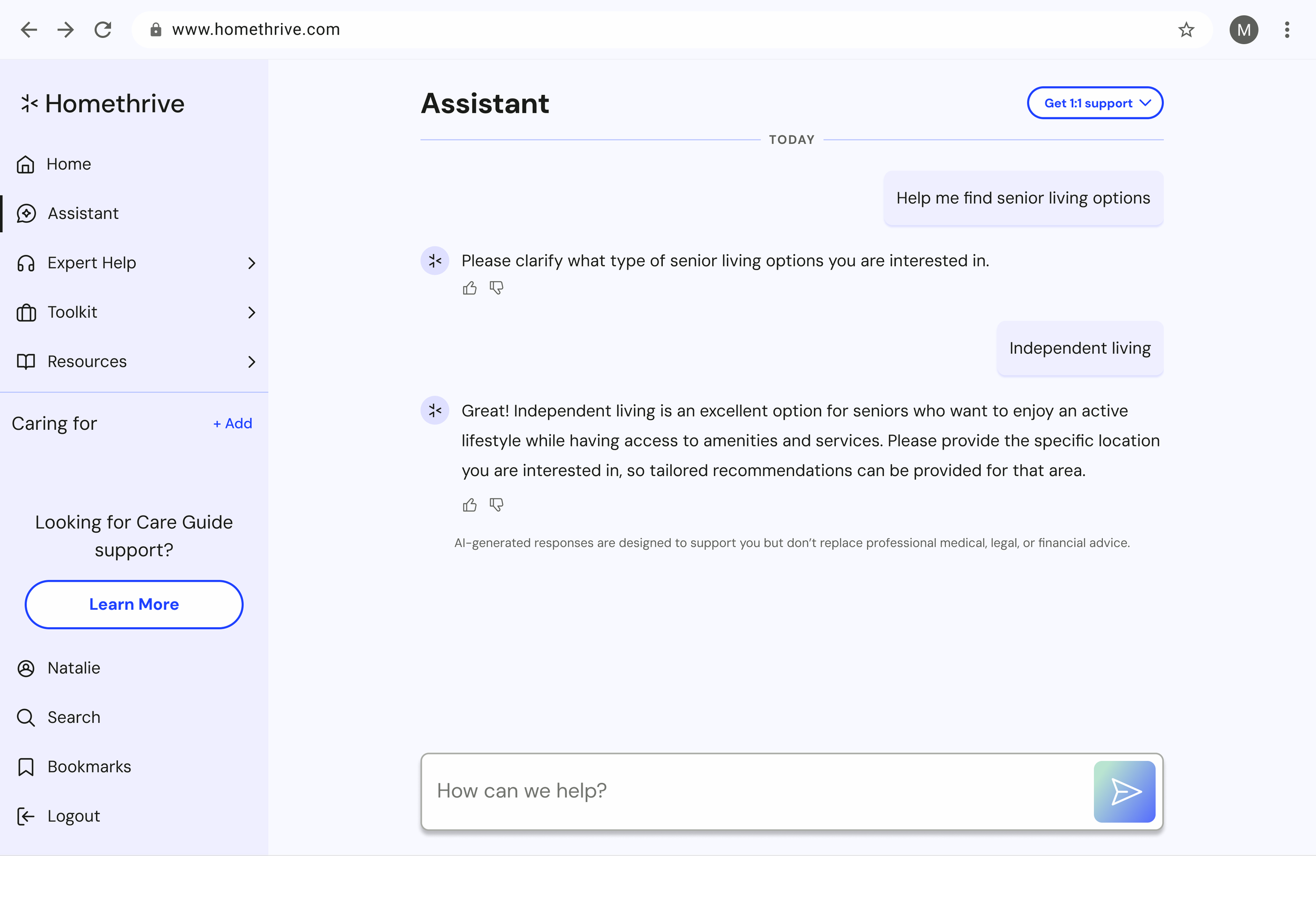
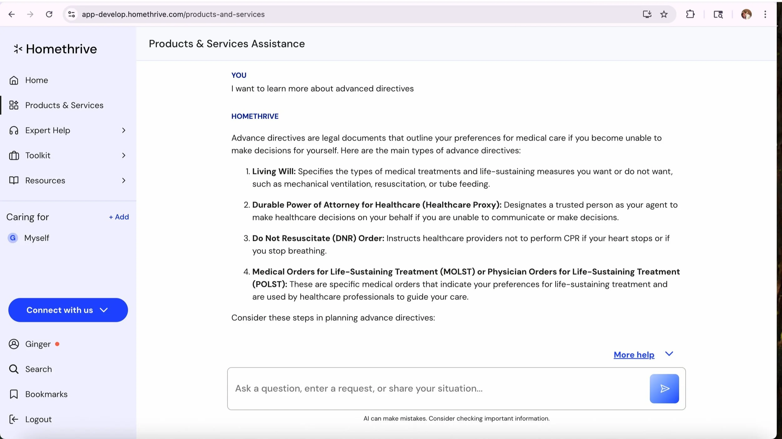
Existing MVP assistant designs
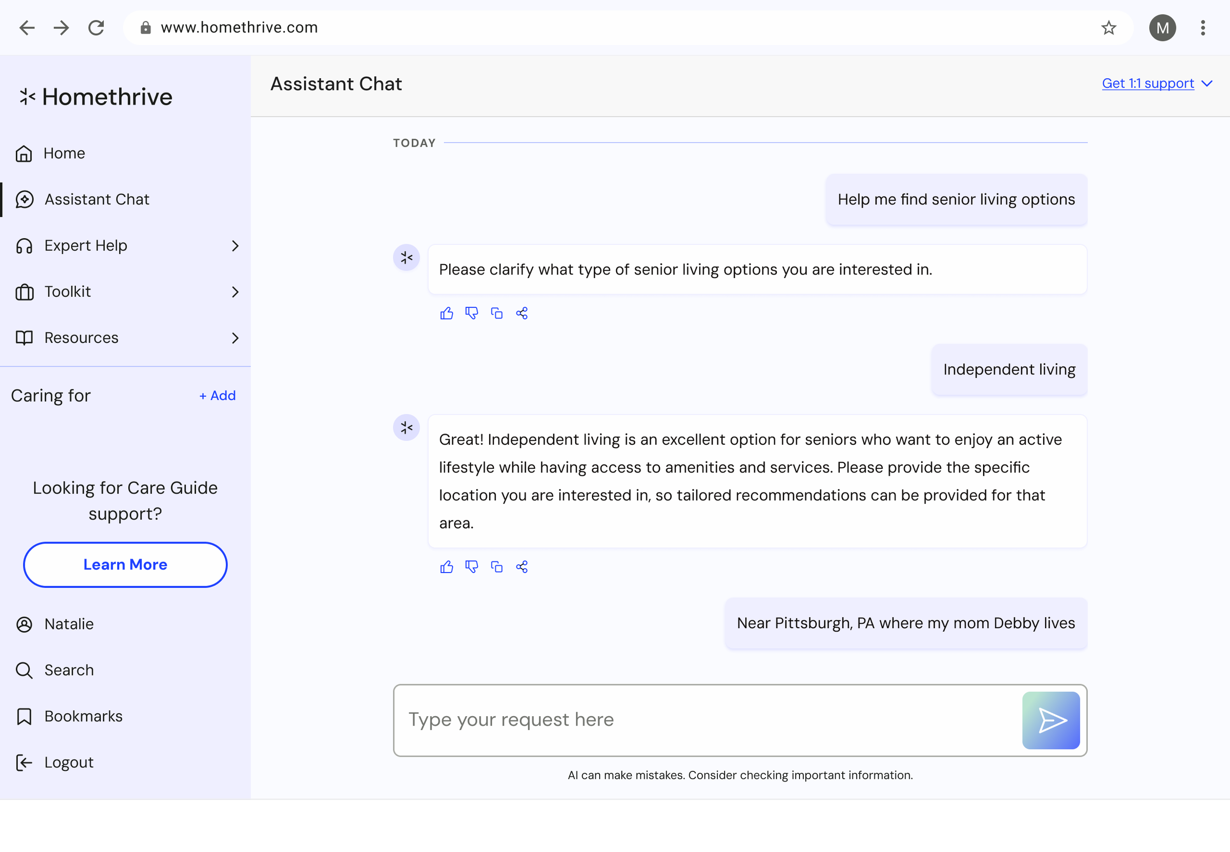
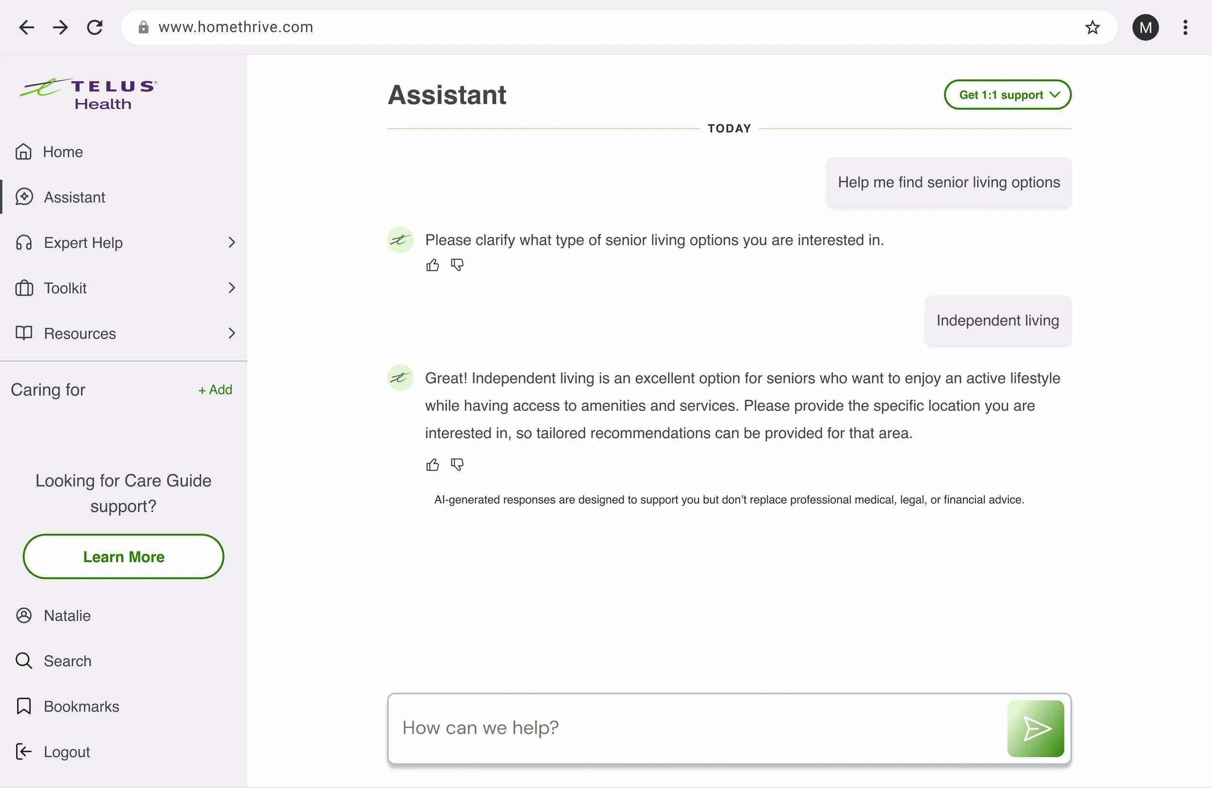
Desktop MVP Assistant by a prior designer
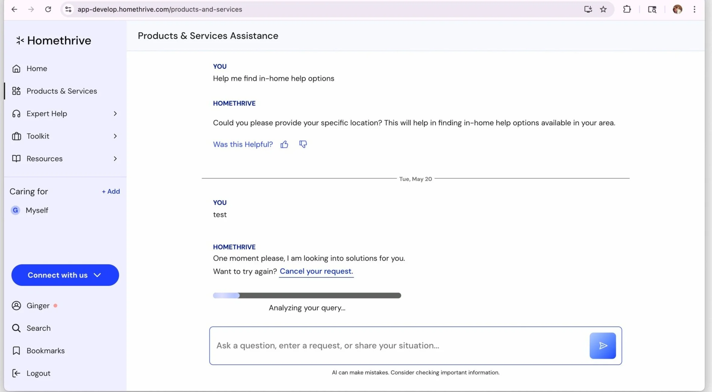
Desktop MVP Assistant showing loading state
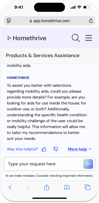
Mobile responsive MVP Assistant by a prior designer
MVP iOS designs
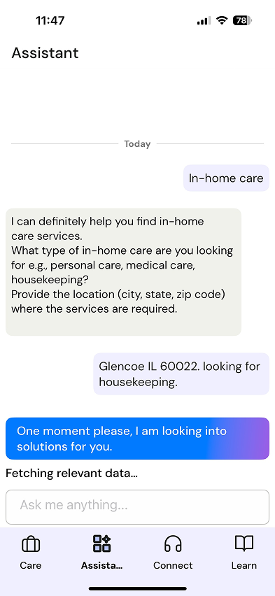
MVP ios Assistant entrypoint
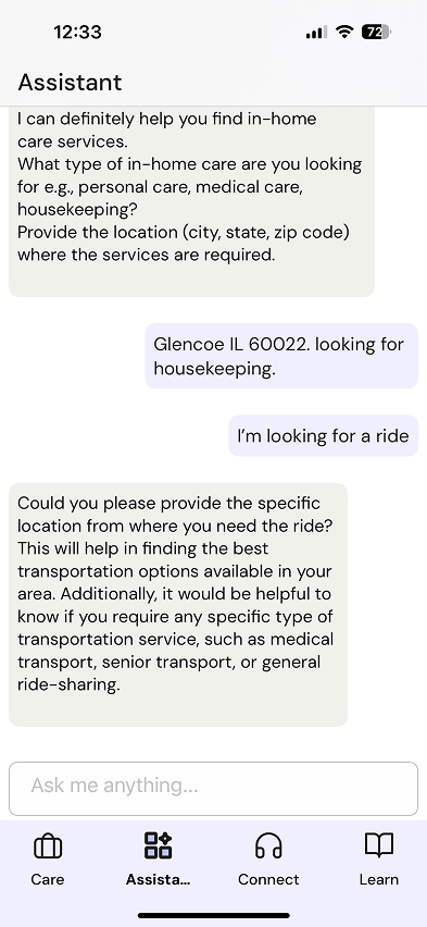
MVP Assistant Conversation + loading state
MVP Assistant Conversation + loader
My DESIGN PROCESS
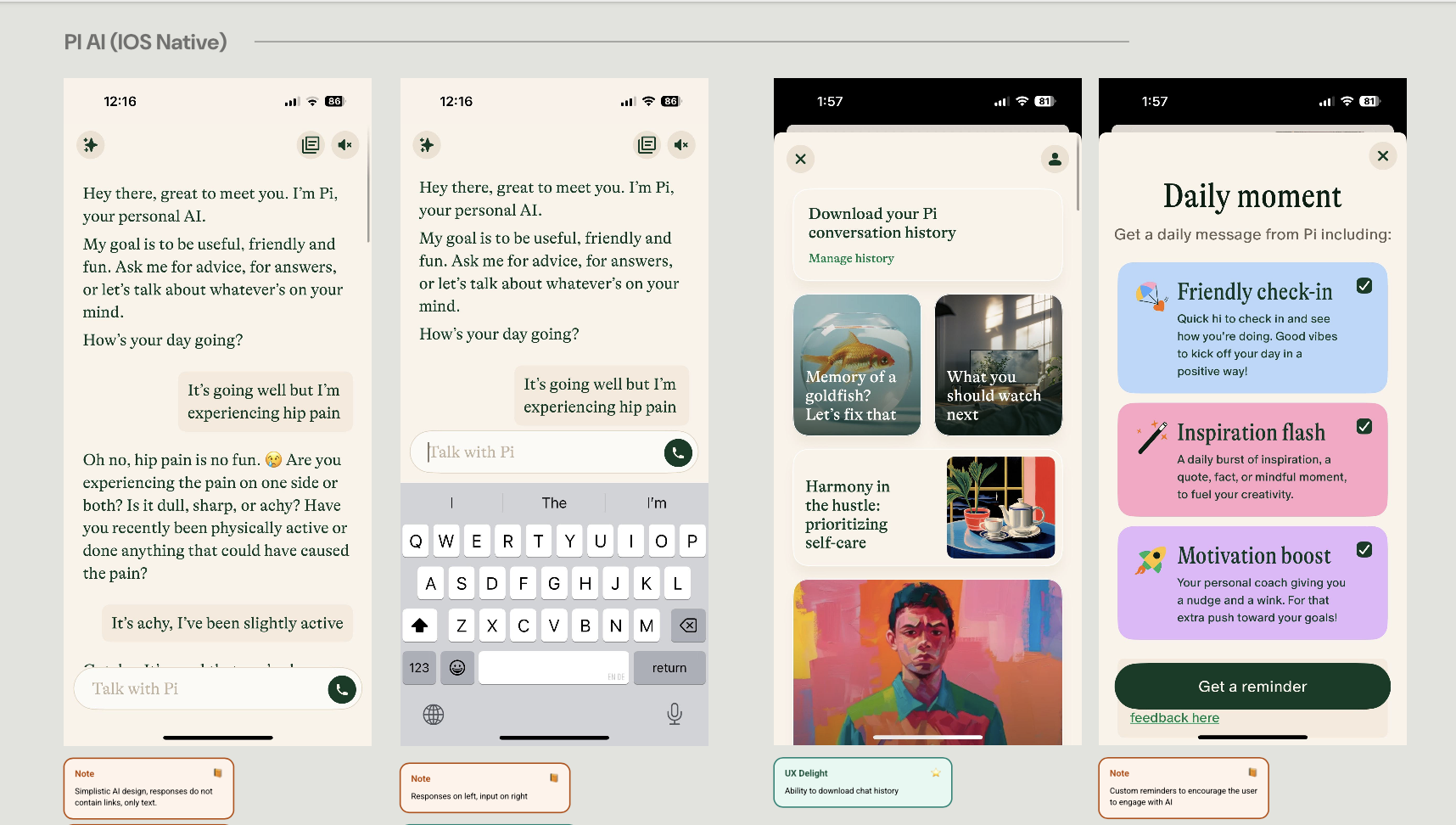
I conducted an in-depth visual analysis of 10 popular conversational AI Assistants on responsive web and iOS applications.
From the analysis, I identified functional UI patterns and animations that could enhance the existing Assistant experience, such as card CTAs, start/stop controls, multi-select responses, and thoughtful streaming animations.
I also analyzed the current MVP design and identified UI/UX issues:
It is difficult to separate the user input from the assistant output
The loading bar animation made the loading time feel even longer
Content is condensed and difficult to scan and read through
Content is static, and there are limited opportunities for engagement (only text links).
Worked closely with product, development, marketing, and other stakeholders to align on a final vision.
Due to project constraints, I could not change the UX for sentiment (like/dislike) collection and the one-on-one support flow.
Design concepts during ideation (closest to MVP)
Updated/final designs (responsive)
Cleaner conversation flow
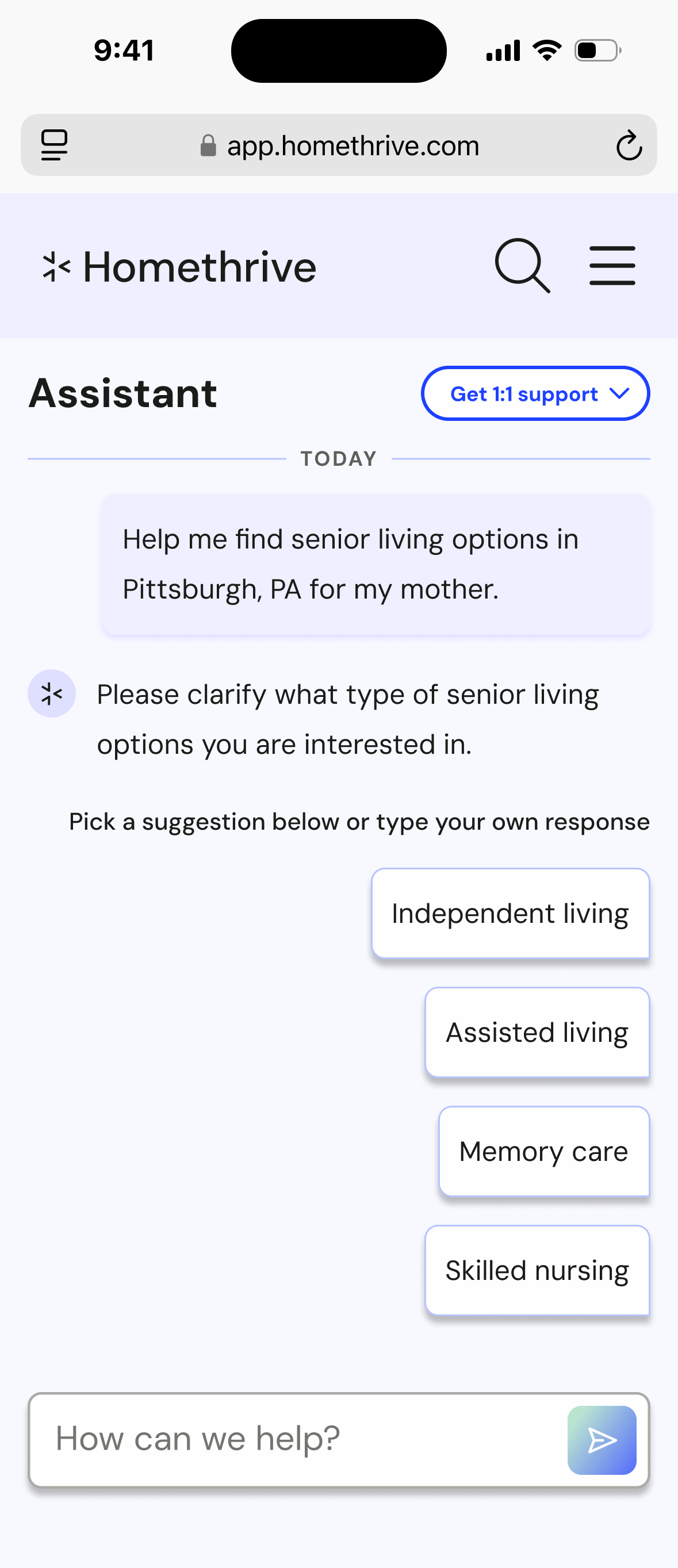
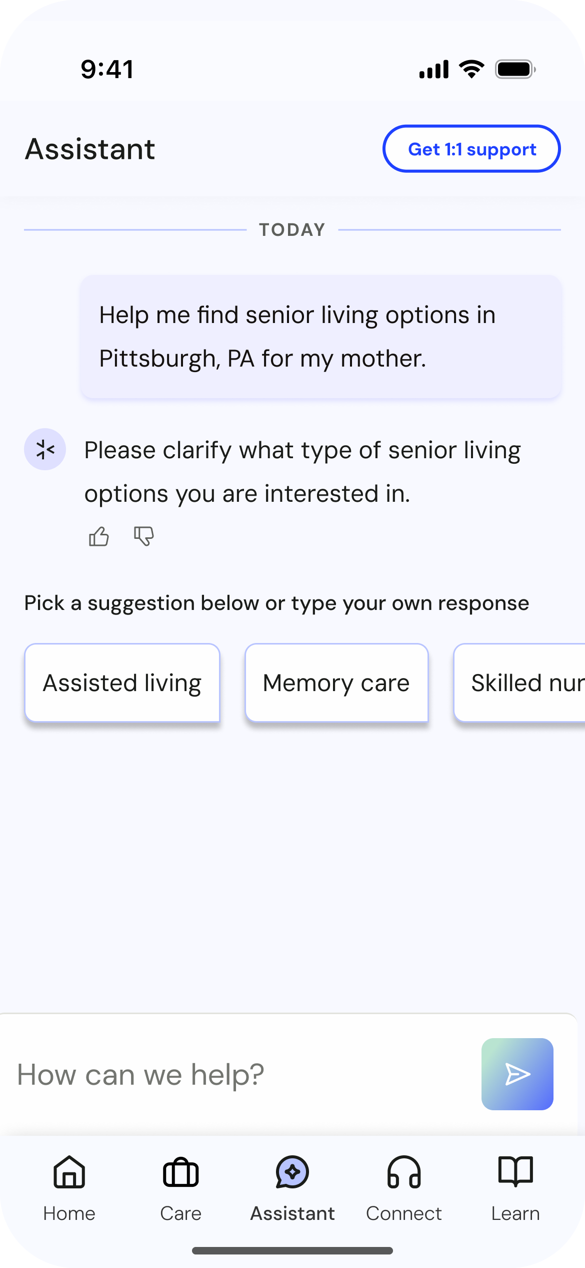
Introduced response types so users can spend less time typing
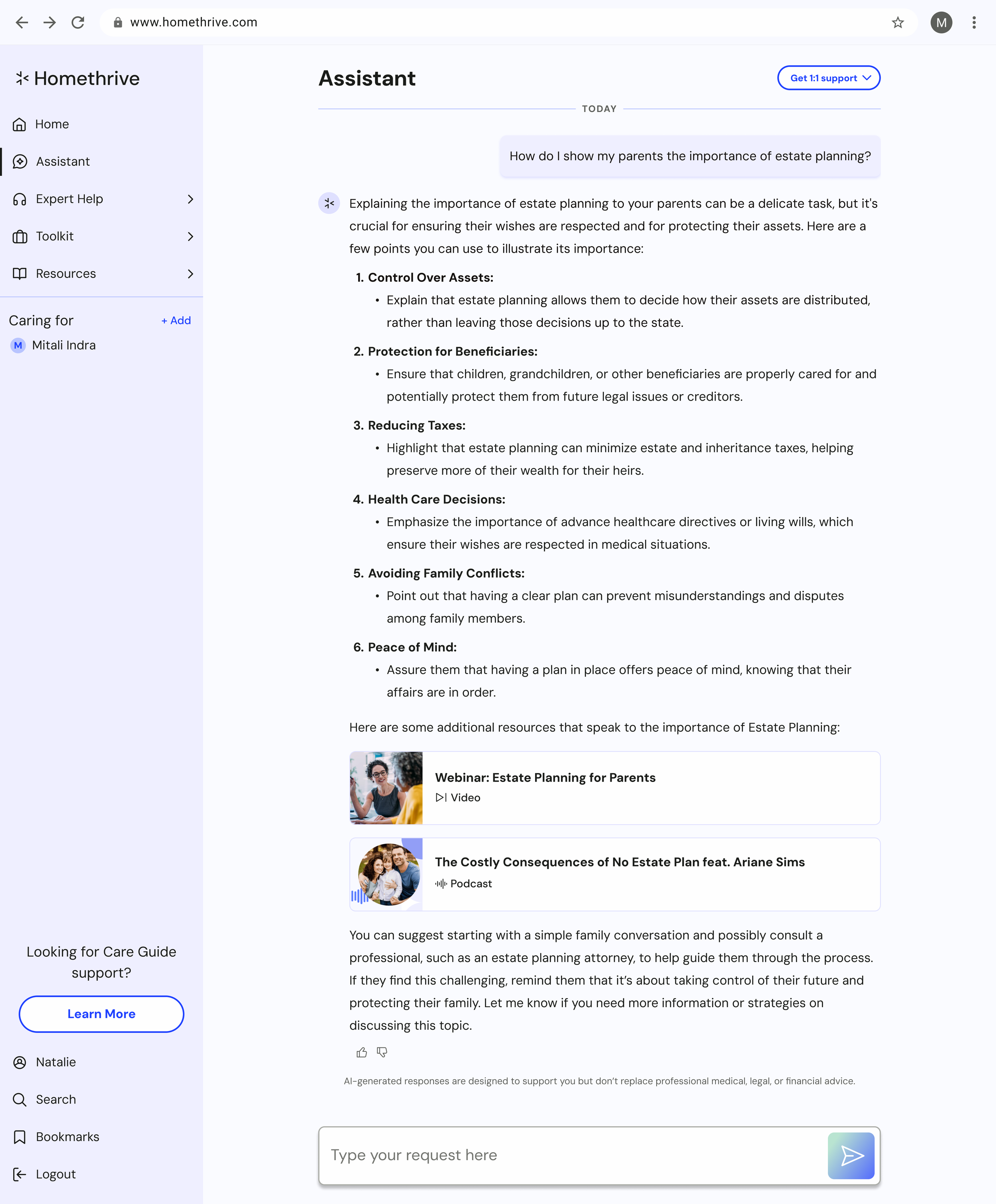
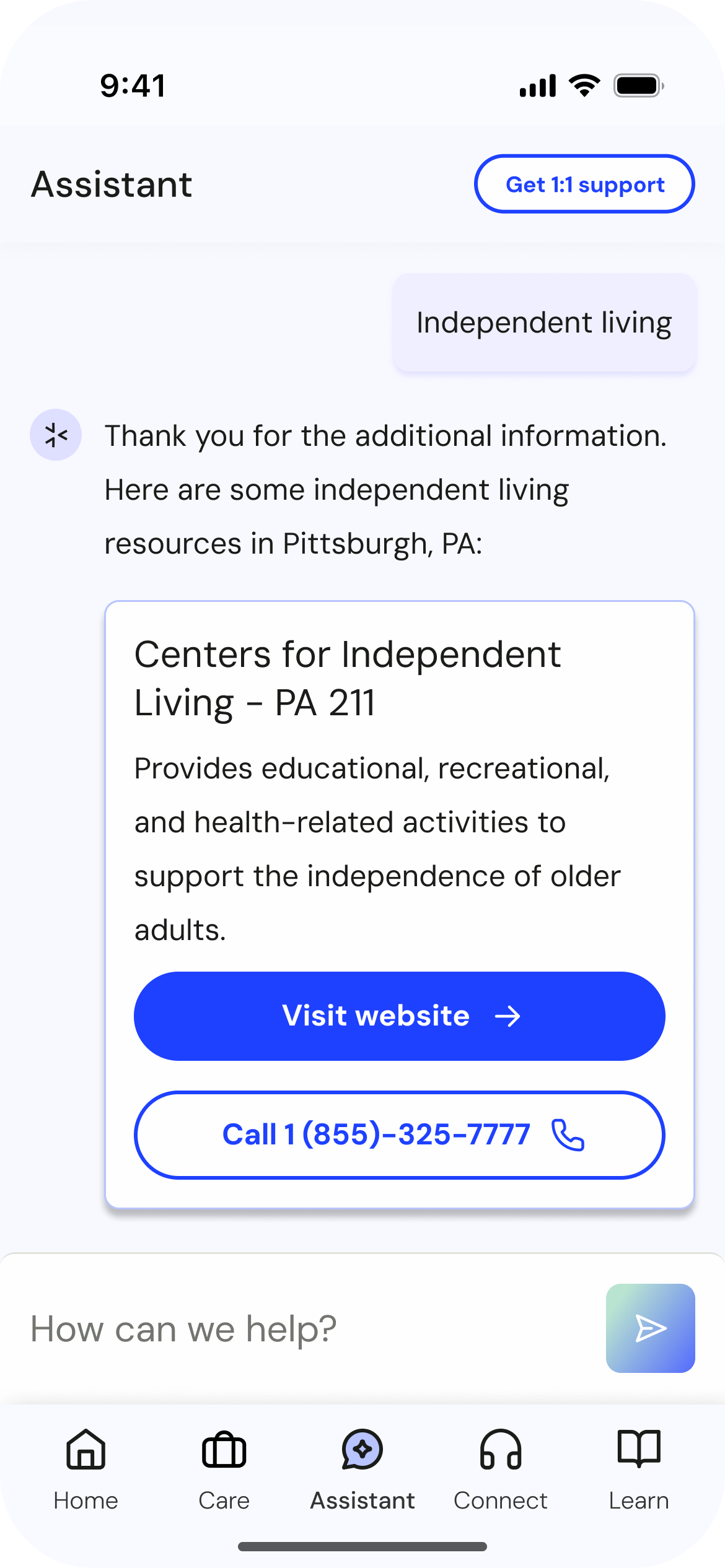
Introduced simple resource cards to replace external links and rich resource cards that linked to Homethrive’s internal resource bank.
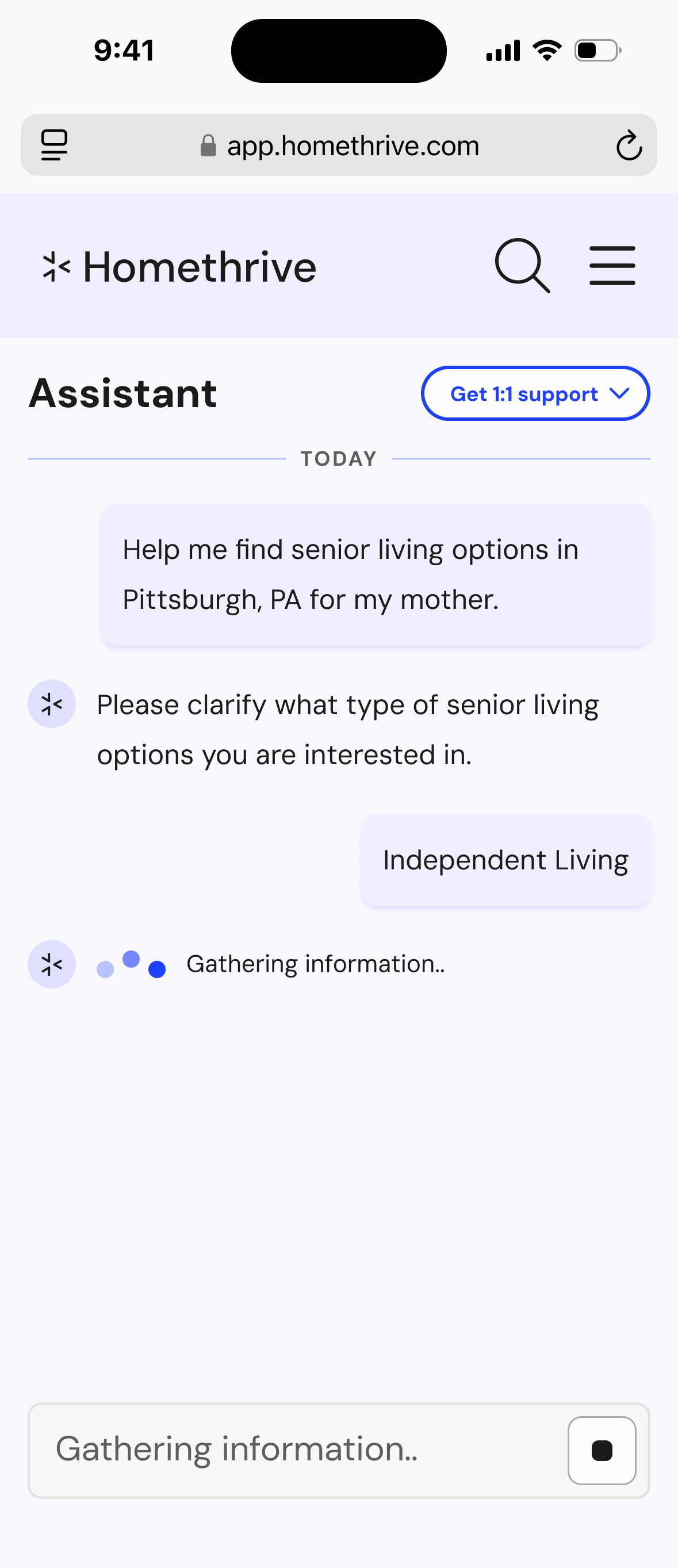
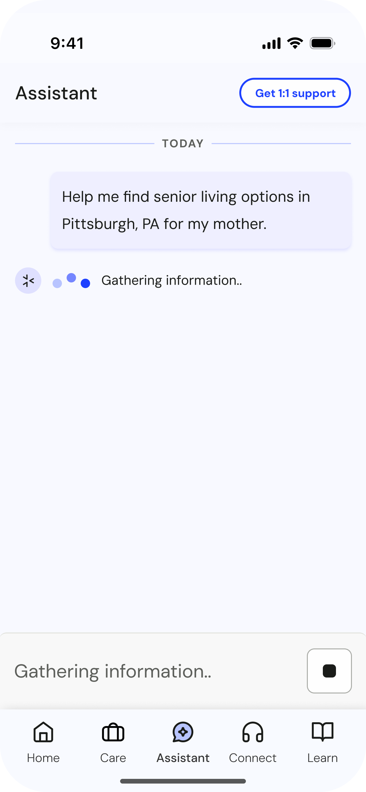
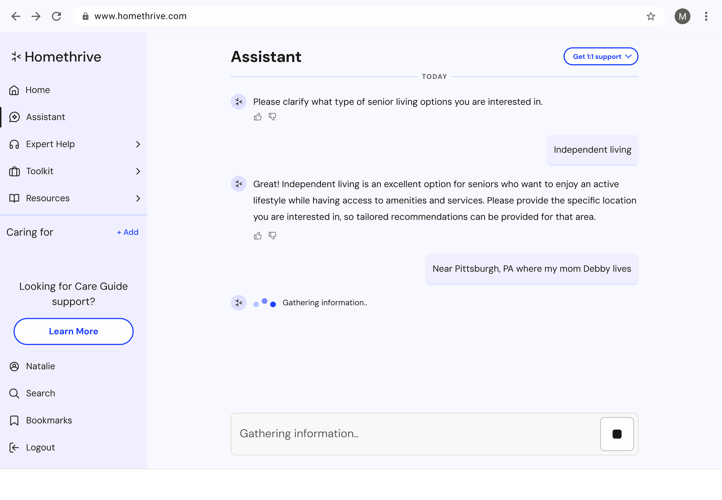
Introduced a more efficient loading animation and gave guidance on streaming
Introduced a cleaner way to stop conversations
Conversation showing suggested response types
Updated responsive reloading state with worm animation. The text input box shows “stop control"
Conversation showing external resource cards
Conversation showing rich resource responses
Example of a client white-labeled project
Updated/final designs (iOS)
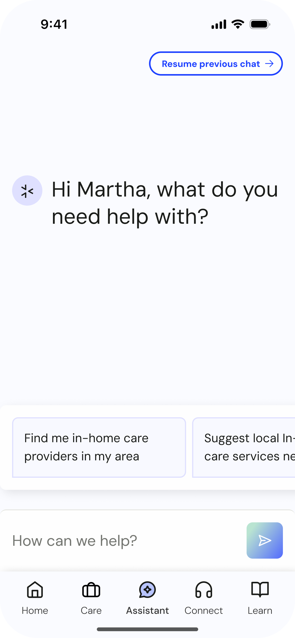
Updated iOS entry point with suggested carousel prompts
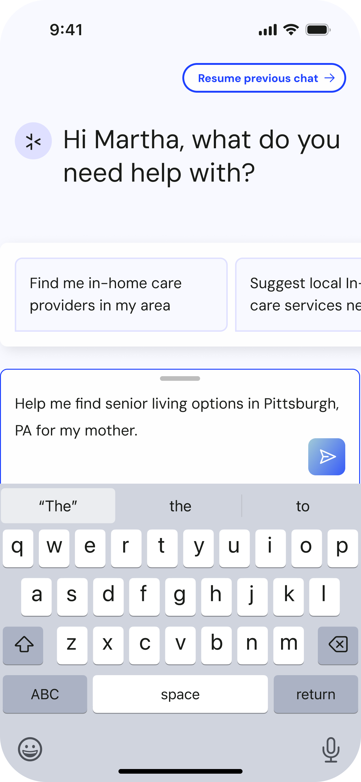
Text input state
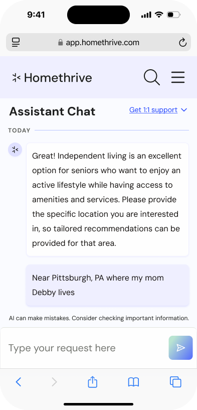
iOS loading state
Conversation showing suggested response types user can swipe through
Conversation showing external resource cards. iOS uses buttons instead of links.
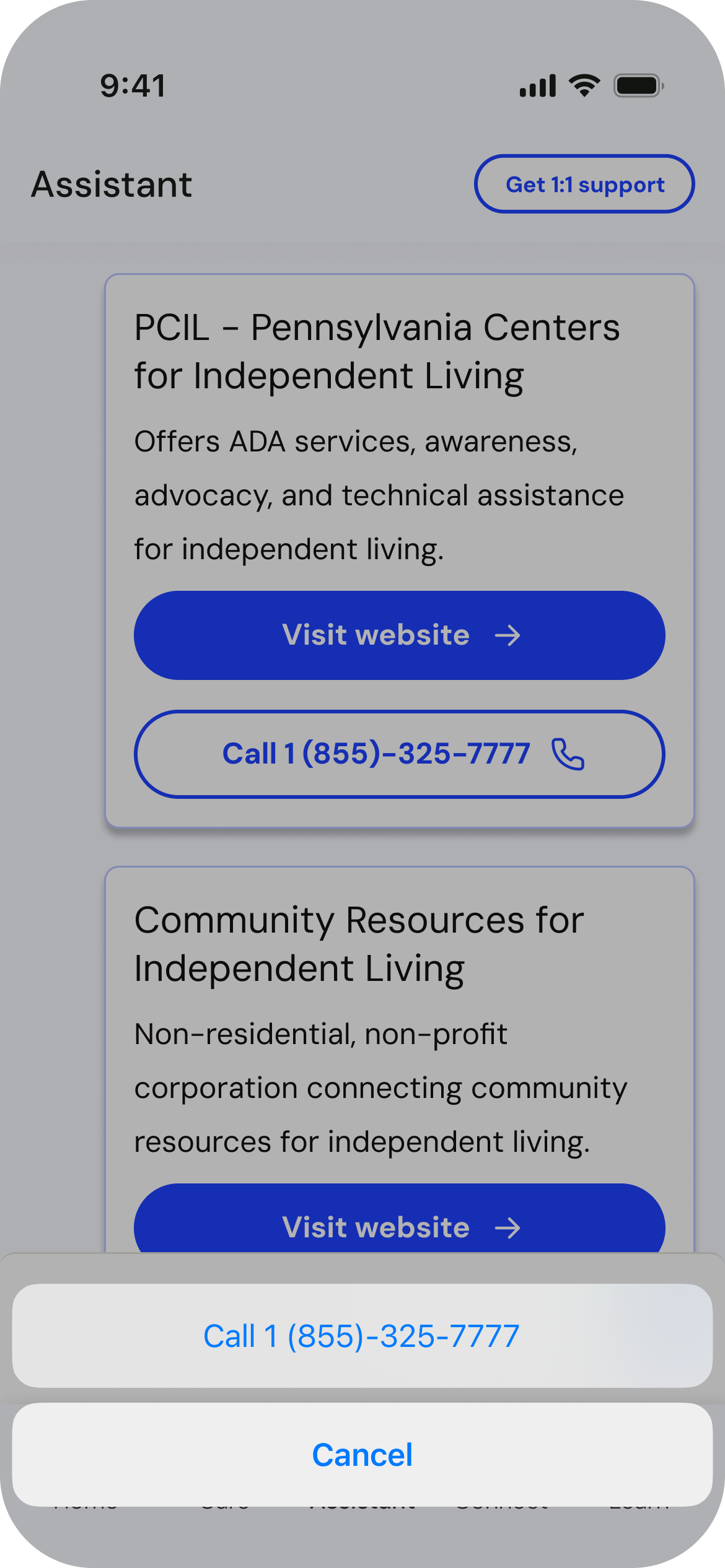
Click to call on iOS
Project Outcomes/Thoughts
I was laid off in May 2025 and was able to see this project's completion, but feedback internally from all stakeholders was overwhelmingly positive.
I strongly recommend that future versions of this Assistant focus on improving other areas of the Assistant user experience that I was unable to work on, such as:
Updating user feedback to be baked into the conversation and presented at opportune times, versus using like/dislike icons.
Provide users opportunities to connect with a Care Guide in the chat rather than having them click on a support button.
Continuously improve on animations and micro-interactions that add more delight to the experience.
Design Before/After
