Biometrics education page
A mini Case Study
Intro/objectives
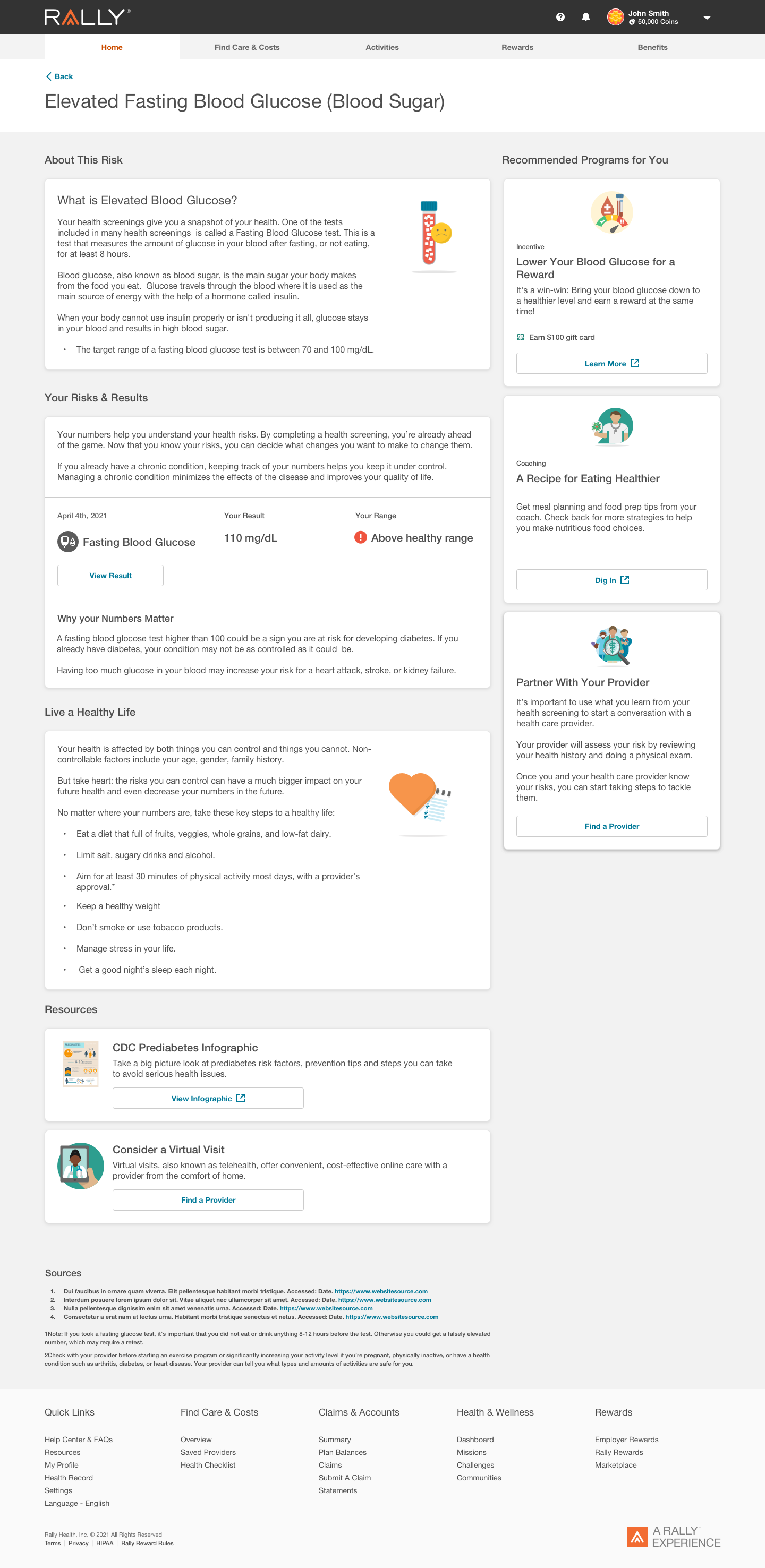
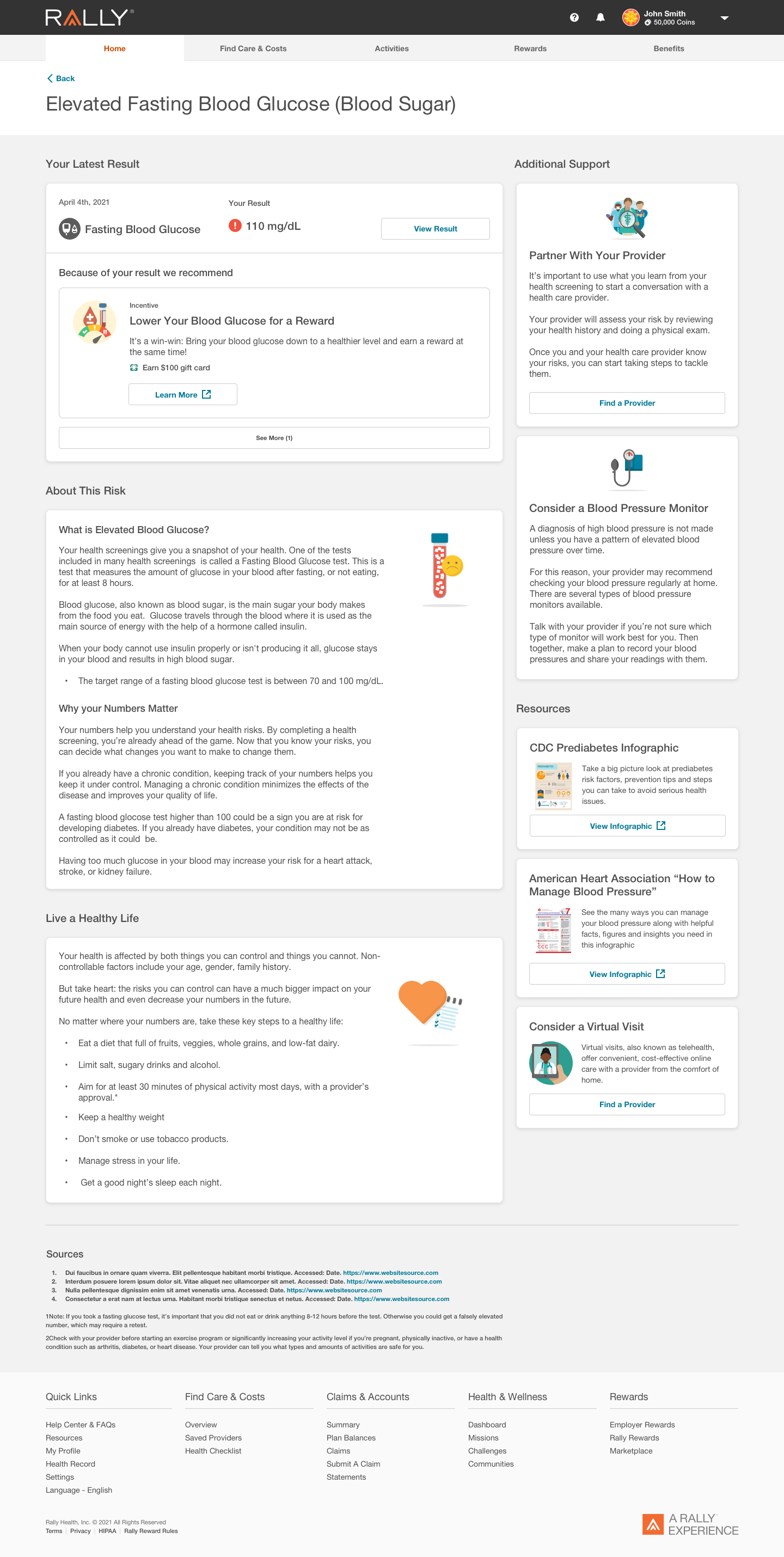
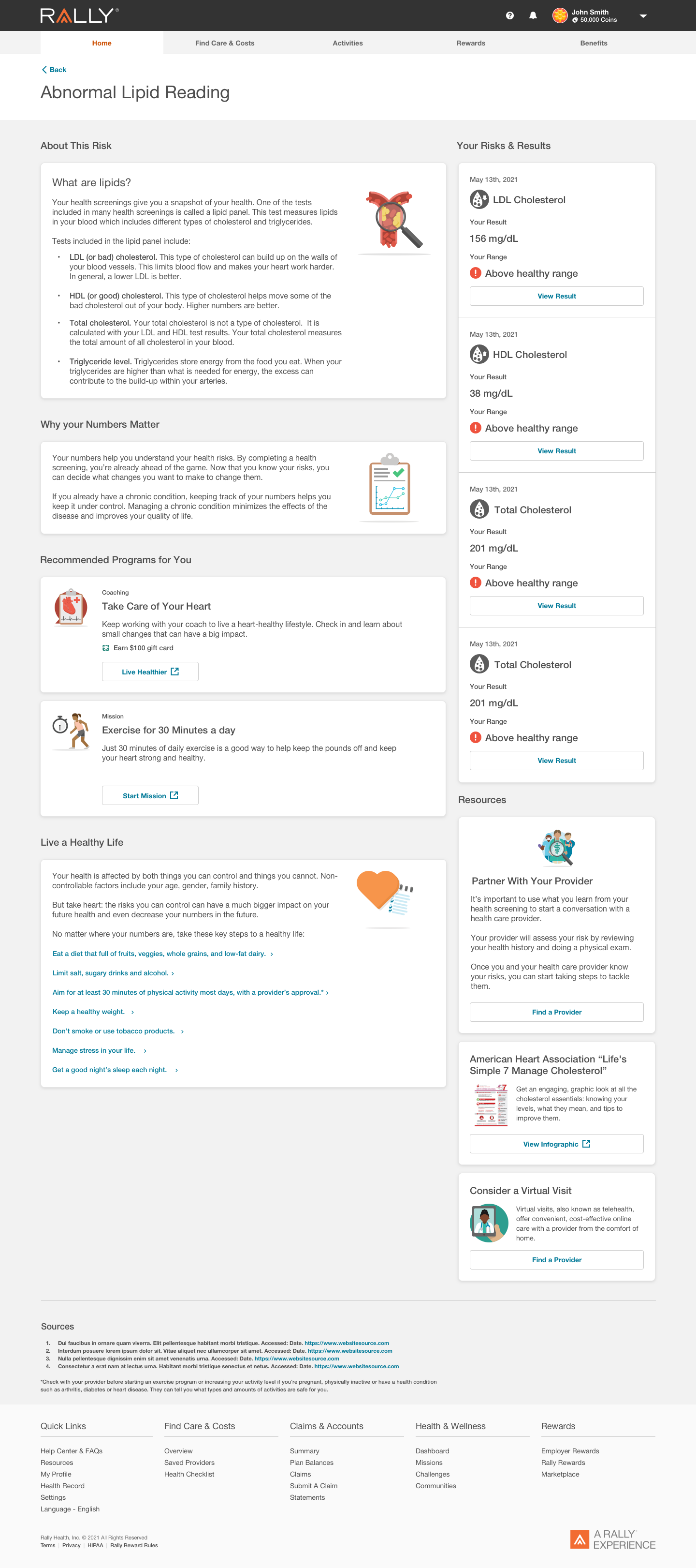
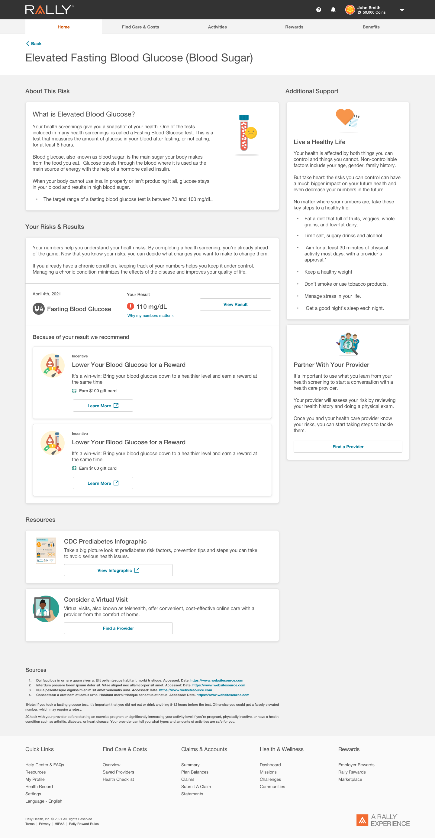
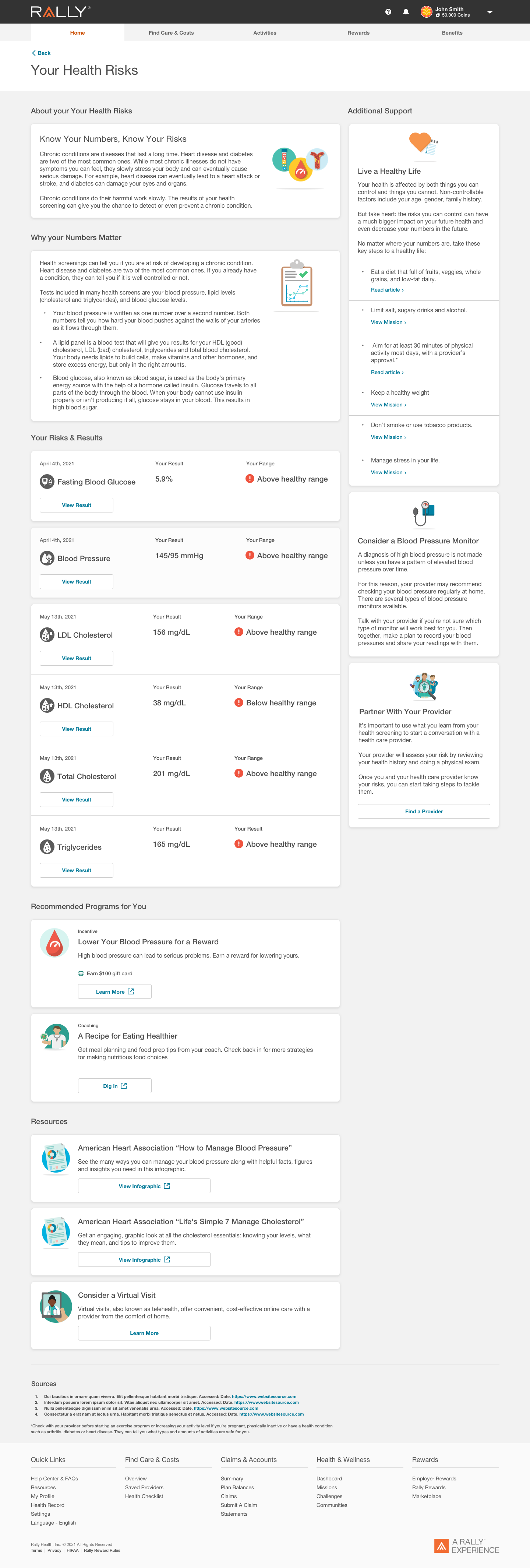
Biometrics screening is an incentive-based reward “package” that employers can offer their employees through the Rally Platform. The biometric dashboard allows employees to set up, schedule, and view their biometric results once their screening is complete. Employees can be rewarded incentives by their employer for taking the screening and improving their readings over time.
Biometric screening provided employees with rewards and customers with personalized data, but it wasn’t offering clear next steps to users on what to do if they had out-of-range readings. In other words, stakeholders saw biometrics as a jumping-off point to send users to programs that could improve their readings and, therefore, their overall health. From a business perspective, this could mean cost savings.
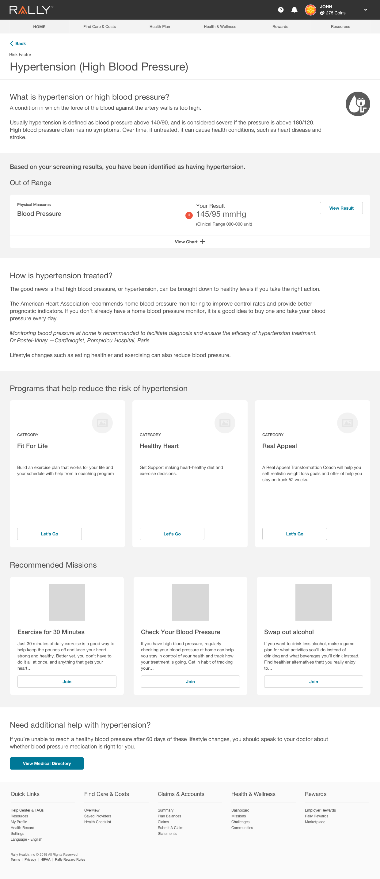
For example, if an employee’s biometric screening is flagged for high cholesterol reading, their recommended programs may be to speak with a physician or start a diet and nutrition coaching program.
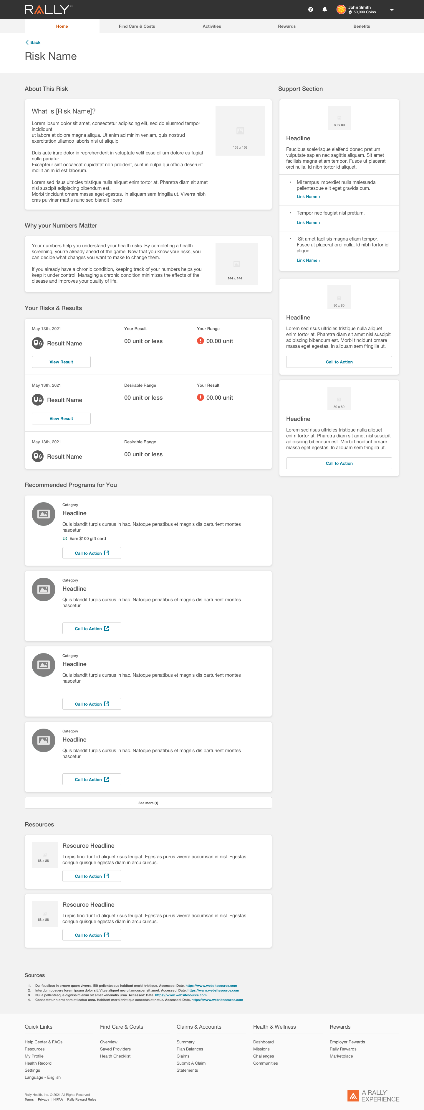
The objective was to create an education landing page where users could learn more about their potential risk factors based on their out-of-range test results and provide them with the appropriate next steps.
The page was also supposed to serve users (in the future) coming from other experiences on the site where they might’ve inputted their readings, separate from the entire biometric experience.
process
First, I created basic wireframes for initial stakeholder review.
process CONT.
Next, I adjusted designs based on changing copy requirements and stakeholder feedback and received inspiration from other designers within collaboration sessions.
Stakeholders had conflicting goals on what content was the top priority. Some felt the “support and next steps” needed to be elevated, whereas others wanted “recommended programs” featured. Content goals and priorities constantly shifted throughout the project process.
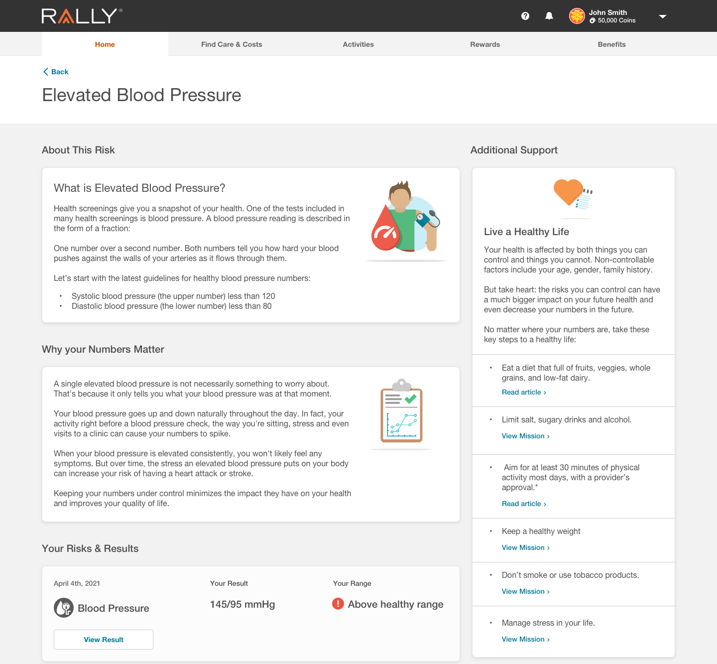
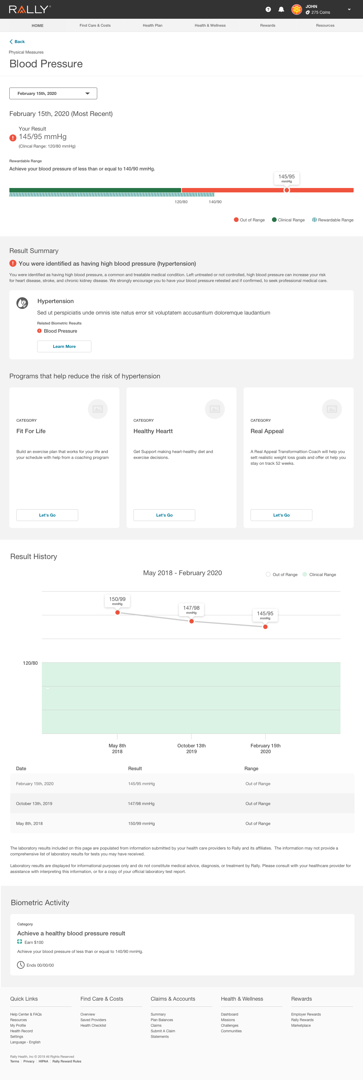
I created an “article” style layout to satisfy stakeholder requests with separated “pods” to break up the content for legibility purposes.
My modular/pod design also benefited layout scalability, so white-label clients could turn on or off sections if needed. In addition, the final product “layout” was a template for future risk factors.


Additional iterations are based on copy evolutions and additional rounds of stakeholder feedback.
process CONT.
From a UX perspective, I was frustrated with the limitations of the copy, which external stakeholders controlled. I felt that the page did not serve those who wanted to know more about the risk factor they had been flagged for, especially if the goal was to have users engage with a recommended program. If users may not fully understand their risks, they may have difficulty understanding how the recommended programs can benefit them.
This was especially true with the “multi-risk” factor page which was displayed to users if they had more than one identified risk factor based on their screening results.
final screens


project learnings/pain points
I felt that the design was created in a “vacuum” due to no user testing and exclusion from various stakeholders’ meetings. Fortunately, user-testing for the entire biometrics dashboard is scheduled for the near future. Some areas I would like to focus on for testing would be:
If users understand the purpose of the page and how it relates to their biometric experience and or self-reporting experience as a whole.
If users understand how suggested recommendations may help them with their identified risk and their biometric numbers.
How easily users navigate to and from various sections within the biometrics experience and other “non-biometric” experiences.
In my opinion, the number of links and CTAs is overwhelming.
The biometric dashboard is not set up for regular data tracking, presenting issues when expanding on an existing model.
External stakeholder’s strategy created potential issues with the understanding of the page.
I focused on page legibility so users could scan for information that they needed.