AI recommendation Cards + Dashboard

Objective
My product team asked me to design a UI for their new machine-learning algorithm in a pilot program. The AI is based on the "recommendations" stage of HIA (Health Impact Assessment), defined as :
"Recommendations (suggesting practical actions to promote positive health effects and minimize negative health effects)." Source: CDC).
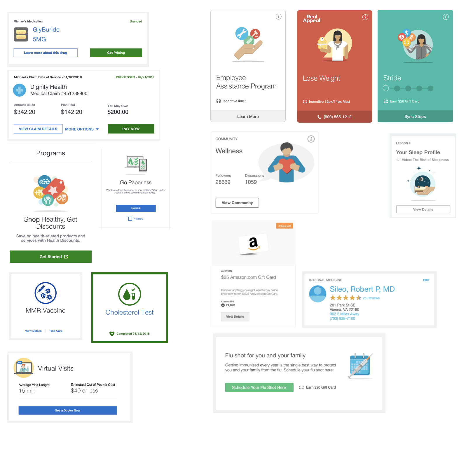
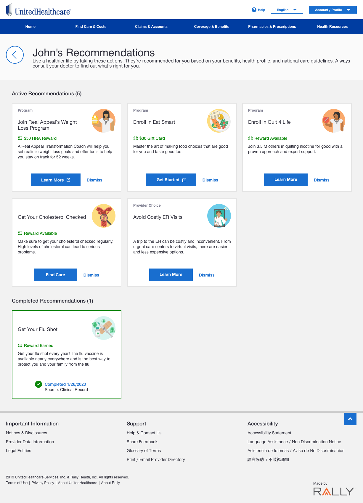
The purpose of the UI was to show purposeful calls to action based on various data sources, such as users' insurance information. For example, a user could be provided a recommendation to get their flu shot or join a smoking cessation program if their data indicated that they would be beneficial programs for their health and could potentially decrease costs.
Product goals of Recommendations are:
To surface the proper action to the right user at the right time.
As opposed to previous program “recommendations” that did not use user data.
A decrease in costs (medical + administrative) for customers, employers, and payers.
Improved health outcomes for consumers.
Why would our clients and stakeholders be interested in Recommendations?
AI-based recommendations + access to large networks of data = differentiator in “personalized” programs compared to competitor spaces.
Recommendations can lower insurance and overhead costs by providing employees with direct access to programs that keep costs down, for example, on-demand virtual visits, Rx delivery through the mail.
Recommendations connect employees to health-improvement programs, such as specialized coaching programs for diet, sleep, and mental wellness, which leads to a healthier and more efficient workforce.
Design Constraints
Net-new product.
Limited data were available to reference or to use in design decisions.
Fellow designer kicked off the project process before my start date.
The product team asked me to create an "MVP" product with room for future enhancements.
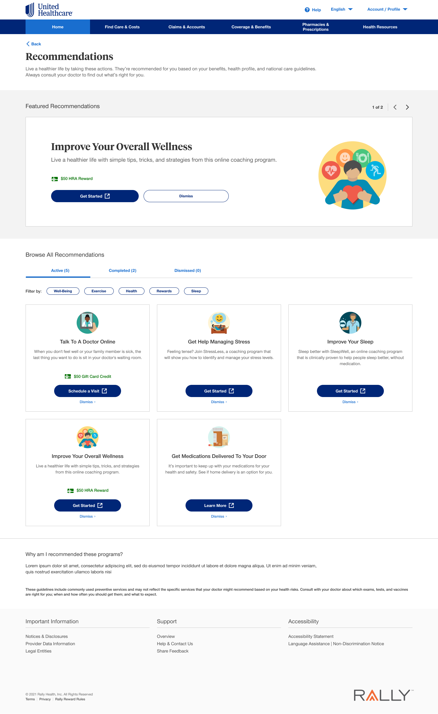
Empathized the focus on card design versus the "card hub."
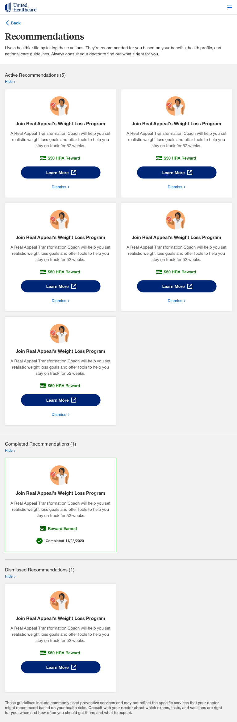
Upon product launch, users would see 0-3 recommendations until more programs were available several months later.
The card designs had to be "fluid" and work in different portal areas, involving various stakeholders.
The card designs had to work across two differently branded platforms.
Brand and new design system refresh midway through the project.
Process
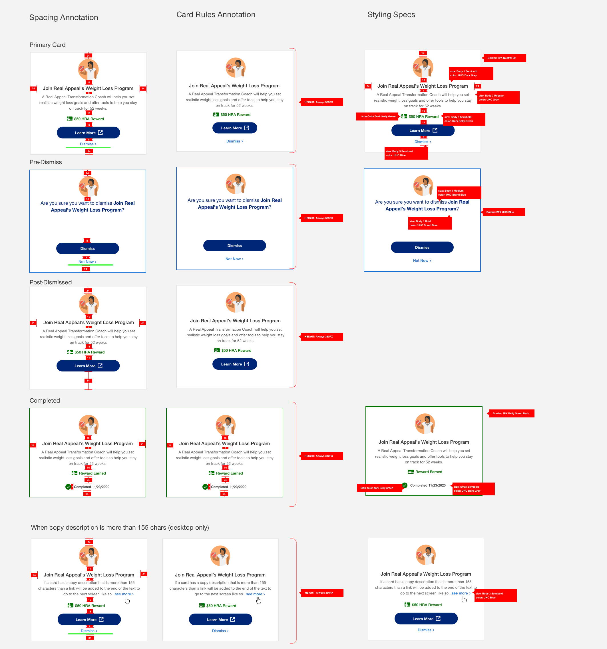
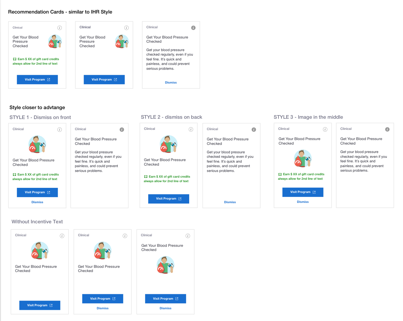
I created an audit of card designs from other internal projects and websites to inform my design decisions then started creating different card designs to share with stakeholders and the design team.
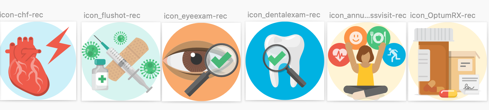
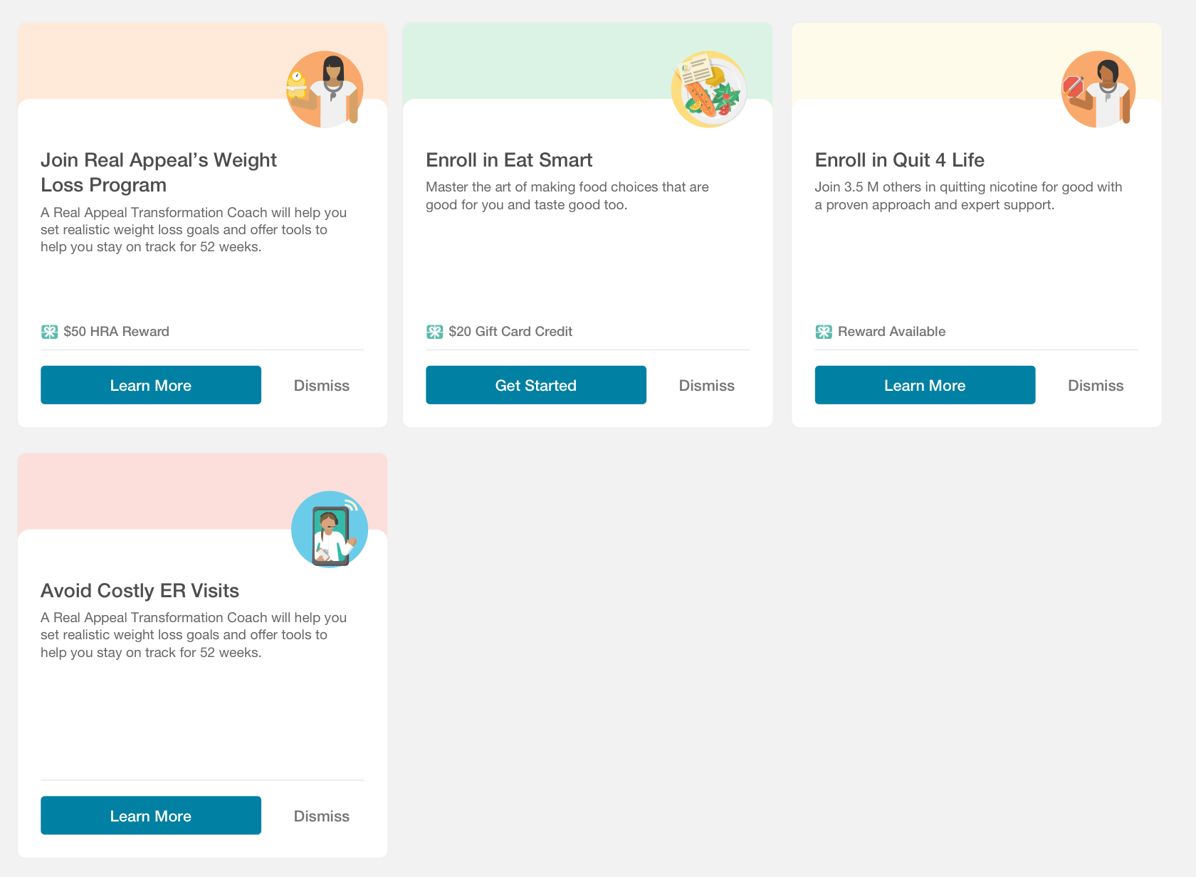
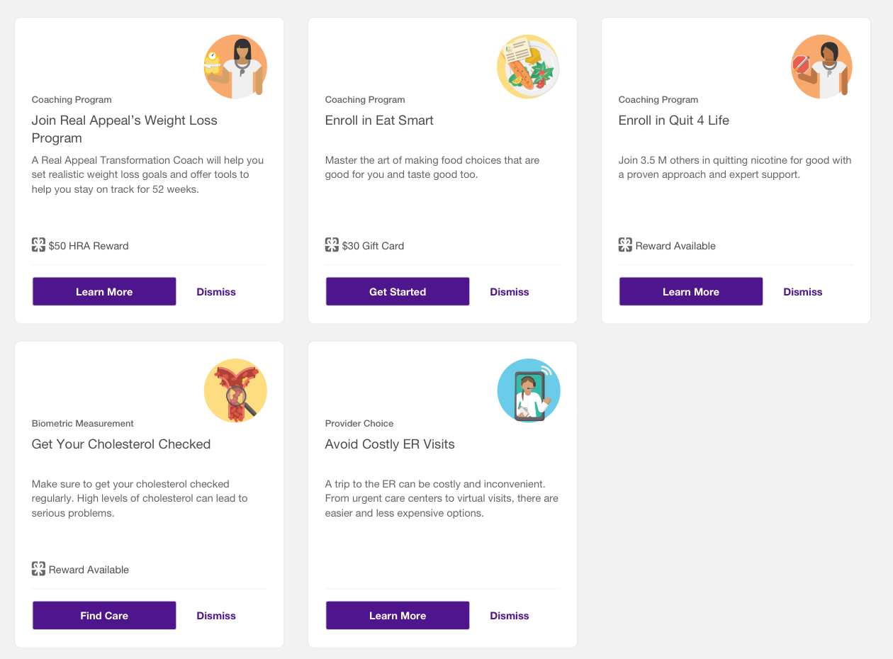
I created an illustration standard with the illustration team so the cards had a "recognizable" look and appeared visually cohesive.
Next, I worked with the UX research team to test my designs with participants, incorporate their feedback, and provide feedback to my team.


final design

The larger card that had the description on the ard face performed the best and was the favorite.
A headline-only card design did not offer enough information about the program.
Users wanted to have more of a visual divider between sections as they seemed to run together.
Working with other stakeholders
“Clinical” Recommendations surfaced within a user’s health record.
The recommendation card design had to adjust to spacing constraints.

Creating a horizontal product
Recommendation cards needed to work within the Rally branded space, as well as for white-labeling for clients.

OutcomeS + Next steps
Other teams have adopted recommendation cards to use within their product spaces.
Because of this project, I now lead an internal card standardization initiative within the design team.
Within the past, ~6 months "view all recommendations" page has been the 4th most visited page, behind claims, search & benefits.
10% of all Dashboard traffic ("MyUHC home") goes to the "view all recommendations" page.
38% of users interact with content on the page.
Recommendation users are 1.2x more likely to engage with virtual visits vs. general virtual care traffic.
10% of which begin a virtual visit with a provider.
2x more likely to perform a provider search vs. general search traffic.
2.2x more likely to look at provider search details vs. general search traffic.
"MVP" dashboard design has outgrown its scope. It needs to be updated to account for more cards and card categories.
We need to improve data parameters around recommendations that could be considered "insensitive" to patient populations. For example, every woman aged 18-35 receives a "healthy pregnancy" recommendation.
We need to be more transparent to users about why they are being recommended what they are.
We need to create user-personas and corresponding user-flow diagrams to understand our product and its audience better.
![20 - View All Recommendations @320 [Mobile].png](https://images.squarespace-cdn.com/content/v1/5a24d2138fd4d2ae8d7cfd0c/1628050431793-KXV7CIA221UBPJHSWBFW/20+-+View+All+Recommendations+%40320+%5BMobile%5D.png)